Building the MVP of a Saas platform connecting healthcare admins and students
UX Design
@ John Hancock
B2B Enterprise & B2C
Roles
Product Design Lead
Team
Product Founder
Two engineers
Constraints
Lack of UXR/testing resources
Changing requirements
Short turnaround
Duration
8 weeks
Takeaways
Design Process
description here description heredescription heredescription heredescription heredescription heredescription heredescription here
Design Process
description here description heredescription heredescription heredescription heredescription heredescription heredescription here
User Insights
TL:DR
Design Process
description here description heredescription heredescription heredescription heredescription heredescription heredescription here
Design Process
description here description heredescription heredescription heredescription heredescription heredescription heredescription here
Solution:
-
description here description heredescription heredescription heredescription heredescription heredescription heredescription.
Customer Journey & Holistic Product Thinking


Takeaways
Design Process
description here description heredescription heredescription heredescription heredescription heredescription heredescription here
Design Process
description here description heredescription heredescription heredescription heredescription heredescription heredescription here
User Insights
Project Overview
Project Overview
Apprenta is a startup that helps hospitals build their future workforce by creating scholarship-backed education-to-employment programs that sponsor healthcare students.
Challenge
As the founding product designer, I led the end-to-end design of Apprenta’s entire MVP across two core audiences: admins and students. Designing for two distinct audiences meant constantly shifting perspectives: simplifying complexity for students while enabling precision and control for administrators.
While my time at Apprenta included designing a variety of flows (such as onboarding), this case study highlights the most critical tools I designed for the MVP: an internal program creation tool for admins, and a dashboard experience for students to track their sponsorship.
Takeaways
Design Process
description here description heredescription heredescription heredescription heredescription heredescription heredescription here
Design Process
description here description heredescription heredescription heredescription heredescription heredescription heredescription here
User Insights
1. Accessibility Audit
Evaluating each page of our current platform against WCAG AAA standards, assessing screen reader compatibility and key navigation—going beyond basic font size and color contrast checks.
2. Research Report
Think like a detective—you don’t know what you don’t know! Collaborating with the call center manager revealed a hidden part of the user journey to me: they flock to customer service after using our platform.
1. Build Context
Collaborate cross-functionally to understand the context and needs.
2. Define & Prioritize
Define use cases and product requirements
3. Design
Iterate on wireframes and gather feedback
Design process
Customer journey to support holistic product thinking
I started by visualizing each flow through a customer journey below for the team to reference and support systems thinking.
Drag and zoom into this imbedded Figma file!
Program Creation Tool
Customer Journey & Holistic Product Thinking
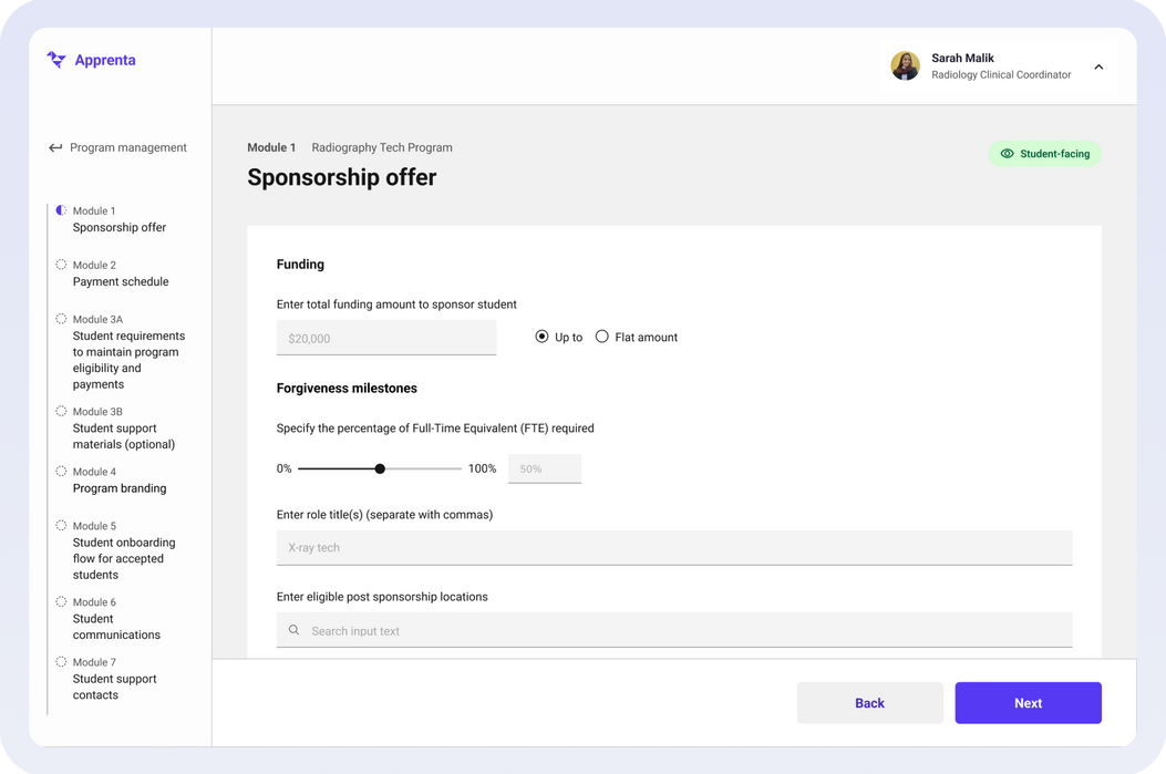
One of the most critical pieces was the program creation tool—a B2B admin workflow tool that enables hospital administrators to create, customize, and publish education-to-employment training programs—streamlining scholarship setup, onboarding, and branding into one cohesive platform.
Customer Journey & Holistic Product Thinking
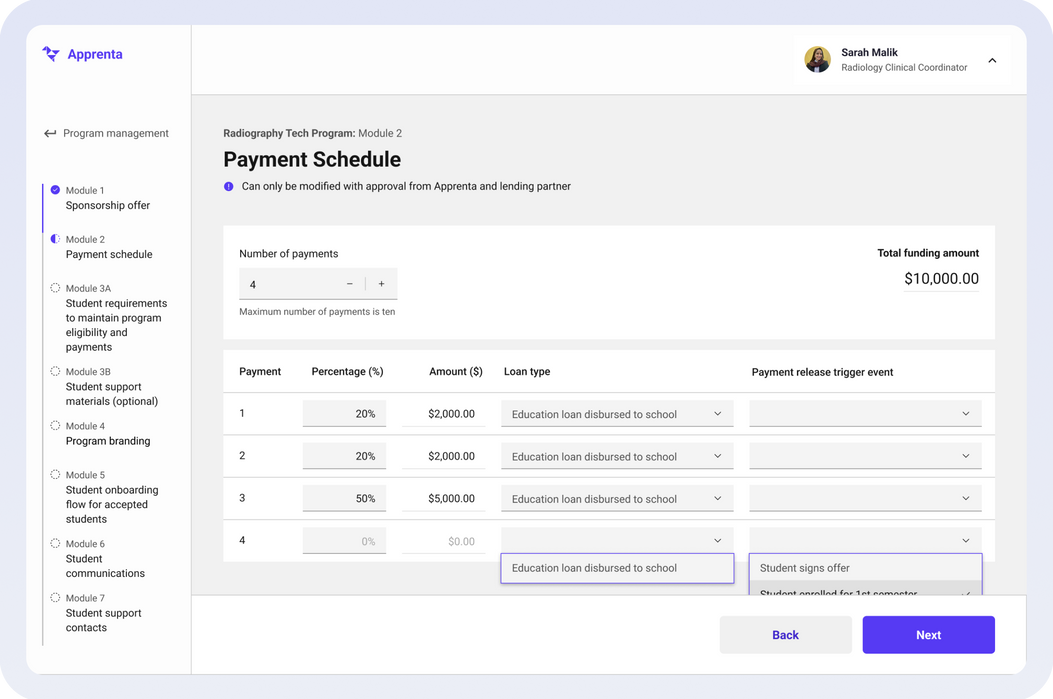
Core Product Flow #1: Admins configure scholarship offer and payment schedule for students, specifying each payment's trigger event before release.
Phase 1: Building Context
Customer Journey & Holistic Product Thinking
Due to the quick turnaround, I had limited access to conduct user research beyond brainstorming sessions with the founder, drawing from his ongoing communication with admins.
What shaped my design approach was a clear understanding that this tool serves internal professionals, not everyday users, who need to get a job done. Keeping the admins’ needs front and center, I grounded my later product decisions in the following key admin needs:
Reduce Cognitive Load
Streamline complex workflows so admins can get their job done quickly.
Problem Solving Over Polish
Prioritize thoughtful UX and interaction design over visual polish to deliver a tool that’s efficient and reliable.
Ensure Scalibility
Design flexible system that adapts to growing complexity of program needs.
1
Set up a scholarship offer and sponsorship payment breakdown for students.
Scholarship Setup
2
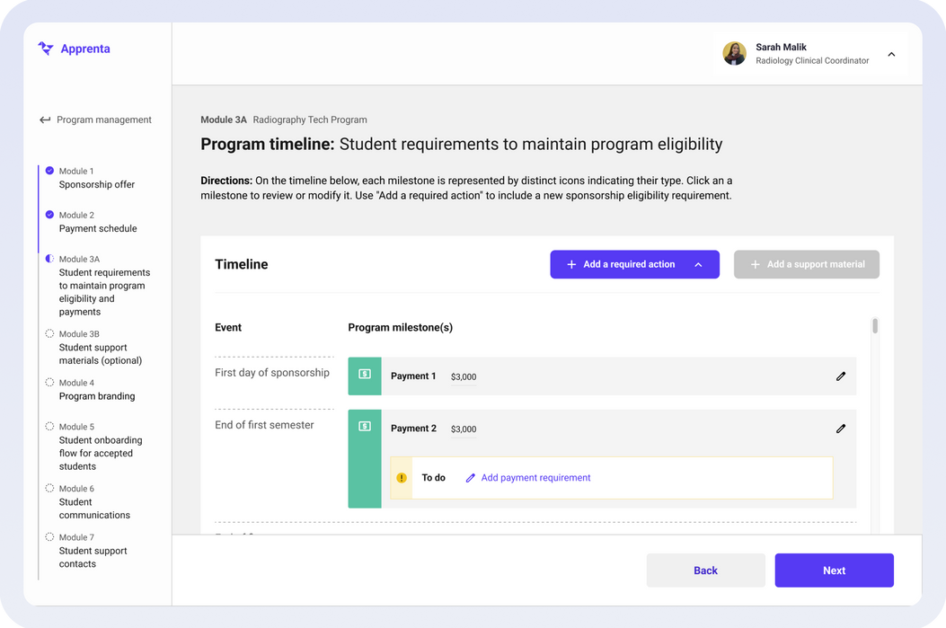
Create a timeline of key student sponsorship milestones, with payment releases and submission deadlines tied to events.
Eligibility Requirements
3
Customize the student-facing program through white labeling and onboarding support such as messages and contacts.
Student Experience Customization
Reduce Cognitive Load
Streamline complex workflows so admins can get their job done quickly.
Problem Solving Over Polish
Prioritize thoughtful UX and interaction design over visual polish to deliver a tool that’s efficient and reliable.
Ensure Scalability
I had to account for edge cases and future program expansion.
Key Admin Needs
Customer Journey & Holistic Product Thinking
Core Product Flow #2: Set up a sponsorship timeline showing when students get their payments, need to submit documentation, and receive helpful resources and updates, so students know what to expect.
Phase 2: Define & Prioritize
Customer Journey & Holistic Product Thinking
Before diving into design, I spent significant time cross-collaborating with the product founder and engineering team to ground our product requirements with business goals and technical restraints. My role moved beyond a designer, but as a partner in product management—helping the team strategize which features were high-value for MVP launch and which could be pinned for later release.
Together, we shaped the tool’s MVP around three core product flows:
1
Scholarship Setup
Set up the scholarship offer and funding payment schedule for students.
2
Eligibility Requirements
Define the timeline and required documentation students need to maintain eligibility until graduation.
3
Student-Facing UX
Customize the student-facing program through white labeling and onboarding support such as messages and contacts.
Core Product Flows (MVP)
Customer Journey & Holistic Product Thinking
Core Product Flow #3: Customize the student-facing journey with white labeling (logo and accessible brand color), personalized messages, support contacts, and learning resources.
Student Dashboard
Customer Journey & Holistic Product Thinking
The first touchpoint students would engage in with the admin after their onboarding is the student dashboard. This B2C tool enables healthcare students to track their scholarship payments, access support resources, and stay on top of time-sensitive tasks—like uploading required documentation—to maintain their eligibility throughout their sponsorship by the health admin until graduation.

Takeaways
Design Process
description here description heredescription heredescription heredescription heredescription heredescription heredescription here
Design Process
description here description heredescription heredescription heredescription heredescription heredescription heredescription here
User Insights
Lesson
Lesson
Analytics Can't Tell the Whole Story
Though the former PI Retirement Planner user engagement analytics showed us what the user patterns were, it can’t convey why they exist. For example, in the modal, many users enter $0 their income. Why? Could it be due to discomfort sharing their personal income? We have no idea, just assumptions. This gap in understanding could be filled with qualitative methods.
Takeaways
Design Process
description here description heredescription heredescription heredescription heredescription heredescription heredescription here
Design Process
description here description heredescription heredescription heredescription heredescription heredescription heredescription here
User Insights
Next Steps
Next Steps
Next Steps
1. Soft Launch
Conduct a soft launch and pilot test with a randomized sample audience to validate usability, gauge interest, and gather early feedback on the retirement planner.
2. Data Analytics
Cross-comparing analytics to those of the previous planner (e.g. heat maps) to see how users engage with ours, and focusing on metrics’ (e.g. completion rate) improvement or decline.
3. User Research
Gain a deeper understanding of our users’ sentiments on the financial planner by inviting a variety of John Hancock participants to use it using a speak-aloud method.
2. Communicate to a range of stakeholders early
Think like a detective—you don’t know what you don’t know! Collaborating with the call center manager revealed a hidden part of the user journey to me: they flock to customer service after using our platform.
This case study is under development. Stay tuned!


